


Introduction
Sometimes, it's tough to know where to start. It's something that a lot of developers especially newbies struggle with including me. That's why I'm writing this article so that you know where to start when building a simple navigation menu that's mobile responsive.
I think being able to style a navigation menu for mobile users is like being a superhero. You're helping people! So today, I'm going to help you become the next superhero in town.
For this project, we'll be using Next.js, Tailwind CSS & React Hooks, especially the useState hook. I'll link to the finished project at the end.
Here's a snapshot of what we're going to be building 👇🏾

Prerequisites
Create-next-app
Basics of React and React Hooks
Basics of Tailwind CSS
Git
Ok, so since you're still here, let's do this!
Getting Started
The first thing to do is to create a new Next.js application. You can do this with the help of create-next-app. So open up your favourite terminal and run the command below:
npx create-next-app@latest next-tailwind-sidebar
Please note that next-tailwind-sidebar is the name of the project. You can name this whatever you like but for this tutorial we are using next-tailwind-sidebar.
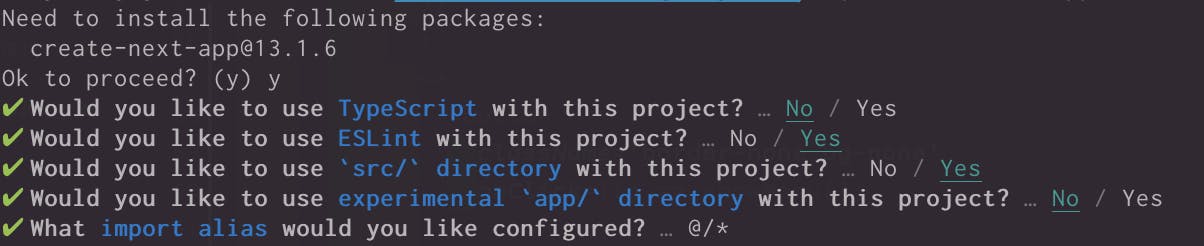
When you run the command above, you'll run into some questions like the ones below. This is all dependent on you however, for this project this is the configuration we are going with.
Once the installation is complete, go into the newly created folder by running the command.
cd next-tailwind-sidebar
Since this tutorial uses VSCode, there's a neat little shortcut to open your project in VS Code from the terminal. It goes a little something like this:
code .
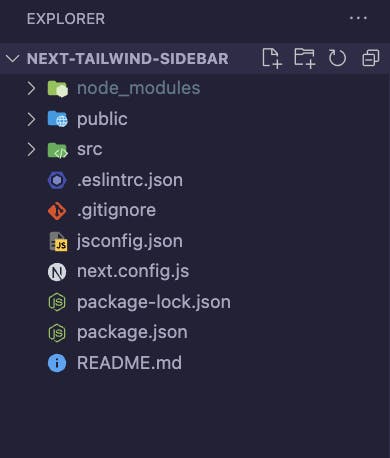
And voila, your new project is set for you to get stuck in! Your project structure should resemble the image below.
Adding project dependencies & Tailwind
Now, it’s time to install our dependencies including Tailwind in our project. First install react-use, an npm package that provides a plethora of react hooks and react-icons, which is an icons library:
npm install react-use
npm install react-icons
Secondly, install Tailwind CSS. To install and set up Tailwind in your project, please follow the instructions for installing Tailwind CSS with Next.js.
Once you're done with the setup, the last thing to do is to get the server running with the command:
npm run dev
Awesome! So our project should now be ready for us to code! Off we go 🏃🏾♀️💨
In the default project, there are stylesheets and other files that come with the setup, go ahead and remove everything in the global.css file apart from the tailwind configurations you already included. You can also remove the Home.module.css file as we won’t be using it.
For this project, we will be creating a components folder that will house our Sidebar.js file which we can then use on the other pages to demonstrate the navigation and sidebar. Ideally, the navigation/sidebar component should be imported in for example your Layout file so that it’s available across all pages. However, we will be importing it on each page due to the simplicity of this project.
Also, go ahead and create 3-4 pages in your pages folder which we will use as our navigation links. For this project, I’ve created about.js, contact.js, product.js & services.js. As a start, these files will simply include the names of the files like so:
import React from 'react';

const Services = () => {
  return (
      <div className='text-lg font-bold'>
        <span>Services</span>
      </div>
  );
};

export default Services;
In the index.js file, go ahead and remove all the irrelevant imports and also the code inside the main tag. Your index file should now look like this.
import Head from 'next/head';

export default function Home() {
  return (
    <>
      <Head>
        <title>Next & Tailwind Sidebar</title>
        <meta name='description' content='Generated by create next app' />
        <meta name='viewport' content='width=device-width, initial-scale=1' />
        <link rel='icon' href='/favicon.ico' />
      </Head>
      <main>
        {/* Sidebar Component */}
      </main>
    </>
  );
}
As a disclaimer, we will be building the desktop navbar first in this project and then implementing the mobile version which will be the sidebar. But it's a good idea to implement a mobile-first approach when creating your web projects because if we look at the statistics of mobile traffic over the years, it's been on a steady rise. So why not give them the attention they need?
Creating & Styling the Navbar
Without further ado, let’s start with creating and styling the navbar. First, let’s lay down the structure
displayMenu, a function that returns our menu for the navbar) in ourSidebar.jsfile.menuItems, an array of our menu objects
You’ll notice that I’ve also started including the styling as well for the layout of our logo and menu links:
//Sidebar.js

import { Inter } from '@next/font/google';
import Image from 'next/image';
import Link from 'next/link';

import Logo from '../images/loop.svg';

const inter = Inter({ subsets: ['latin'] });

// Menu items
const menuItems = [
  {
    menu: 'About',
    link: '/about',
  },
  {
    menu: 'Product',
    link: '/product',
  },
  {
    menu: 'Services',
    link: '/services',
  },
  {
    menu: 'Contact Us',
    link: '/contact',
  },
];

export default function Home() {

const displayMenu = () => {
    return menuItems.map((item) => (
      <Link
        key={item.menu}
        href={item.link}
        className='pb-5 hover:text-yellow md:pb-0 md:pl-6'
      >
        {item.menu}
      </Link>
    ));
  };

  return (
    <>
      <Head>
        <title>Next & Tailwind Sidebar</title>
        <meta name='description' content='Generated by create next app' />
        <meta name='viewport' content='width=device-width, initial-scale=1' />
        <link rel='icon' href='/favicon.ico' />
      </Head>
      <main>
                {/* Tailwind CSS classes added to navbar */}
        <div className='flex justify-between p-7 shadow-lg items-center'>
          {/* Logo */}
          <div>
            <Image src={Logo} alt='Logo' width={100} height={100} />
          </div>

          {/* Menu links */}
          <div className={inter.className}>
            <div className='text-red'>
              {displayMenu()}
            </div>
          </div>
        </div>
      </main>
    </>
  );
}
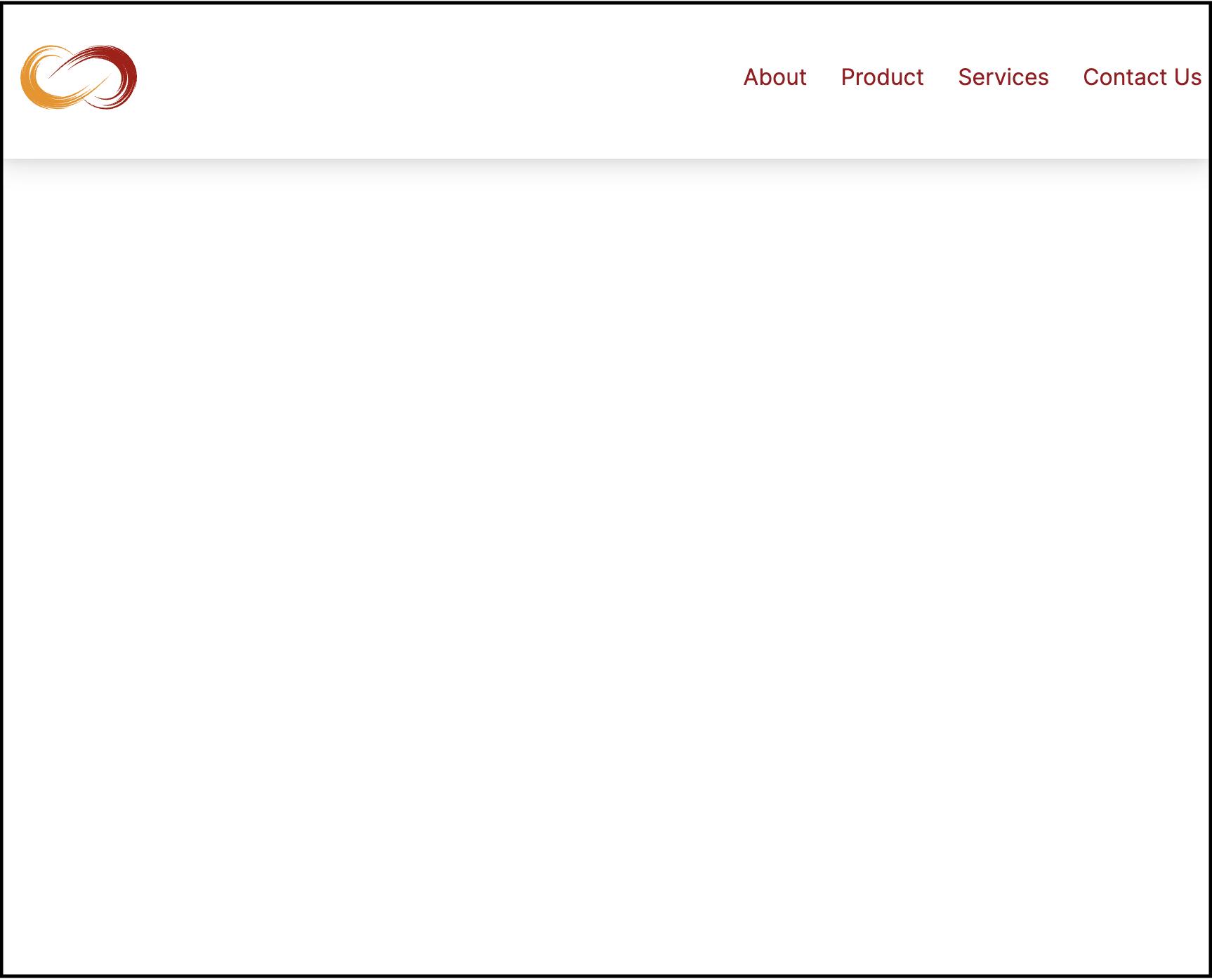
With the code above, your UI should look like this:
Quick side note, you'll notice a div with className={inter.className}. This is one of Next.js's many helpful features. You can read more on their website.
Now the desktop view looks good. Onto the main aspect which is the mobile view. To achieve this, we will utilise the help of a lovely hook in react-use called useMedia. Essentially, it allows us to capitalize on CSS media queries without all the extra work 😉. It goes a little something like this:
const isDesktop = useMedia('(min-width: 768px)', true);
What this piece of code does is that it returns a boolean value whenever the screen width is greater than 768px or not. This way, we can determine when our mobile view should take effect. The second parameter, which is the defaultState is optional but I find (not sure exactly yet as I found some odd behaviour when it's false) that it’s better to include it when using Nextjs. So in our case, we will set it to true.
With that in mind, we can add that to our code:
//Sidebar.js

import styles from '@/styles/Home.module.css';
import { Inter } from '@next/font/google';
import Head from 'next/head';
import Image from 'next/image';
import Link from 'next/link';
import { useMedia } from 'react-use';

import Logo from '../images/loop.svg';

const inter = Inter({ subsets: ['latin'] });

// Menu
const menuItems = [
  {
    menu: 'About',
    link: '/about',
  },
  {
    menu: 'Product',
    link: '/product',
  },
  {
    menu: 'Services',
    link: '/services',
  },
  {
    menu: 'Contact Us',
    link: '/contact',
  },
];

export default function Home() {

const displayMenu = () => {
    return menuItems.map((item) => (
      <Link
        key={item.menu}
        href={item.link}
        className='pb-5 hover:text-yellow md:pb-0 md:pl-6'
      >
        {item.menu}
      </Link>
    ));
  };

{/* NEW LINE */}
const isDesktop = useMedia('(min-width: 768px)', true);

  return (
    <>
      <Head>
        <title>Next & Tailwind Sidebar</title>
        <meta name='description' content='Generated by create next app' />
        <meta name='viewport' content='width=device-width, initial-scale=1' />
        <link rel='icon' href='/favicon.ico' />
      </Head>
      <main>
        <div className='flex justify-between p-2 shadow-lg items-center'>
          {/* Logo */}
          <div>
            <Image src={Logo} alt='Logo' width={100} height={100} />
          </div>

          {/* Menu links */}
          <div className={inter.className}>
            <div className='text-red'>
              {displayMenu()}
            </div>
          </div>
        </div>
      </main>
    </>
  );
}
We will be using the isDesktop variable to determine our mobile or desktop view. To do this, we'll use the ternary operator. So if it is desktop return the current view we have now and if it’s mobile return the mobile view which we will dive into.
Our code should look like this:
//Sidebar.js

import styles from '@/styles/Home.module.css';
import { Inter } from '@next/font/google';
import Head from 'next/head';
import Image from 'next/image';
import Link from 'next/link';
import { useMedia } from 'react-use';

import Logo from '../images/loop.svg';

const inter = Inter({ subsets: ['latin'] });

// Menu
const menuItems = [
  {
    menu: 'About',
    link: '/about',
  },
  {
    menu: 'Product',
    link: '/product',
  },
  {
    menu: 'Services',
    link: '/services',
  },
  {
    menu: 'Contact Us',
    link: '/contact',
  },
];

export default function Home() {

const displayMenu = () => {
    return menuItems.map((item) => (
      <Link
        key={item.menu}
        href={item.link}
        className='pb-5 hover:text-yellow md:pb-0 md:pl-6'
      >
        {item.menu}
      </Link>
    ));
  };

const isDesktop = useMedia('(min-width: 768px)', true);

  return (
    <>
      <Head>
        <title>Next & Tailwind Sidebar</title>
        <meta name='description' content='Generated by create next app' />
        <meta name='viewport' content='width=device-width, initial-scale=1' />
        <link rel='icon' href='/favicon.ico' />
      </Head>
      <main>
        <div className='flex justify-between p-2 shadow-lg items-center'>
          {/* Logo */}
          <div>
            <Image src={Logo} alt='Logo' width={100} height={100} />
          </div>

          {/* Menu links */}
          <div className={inter.className}>
            <div className='text-red'>
              {/* NEW LINE */}
              {isDesktop ? () : ()}
            </div>
          </div>
        </div>
      </main>
    </>
  );
}
All we’ve done is remove the displayMenu() call and include our ternary operator to check if we are in desktop view or not. Now, in the first bracket, which is what will be returned if the screen size is greater than 768px, we will include our initial desktop view which calls the displayMenu() function like so:
<div className='text-red'>
    {isDesktop ? (
      displayMenu()
    ) : ()}
</div>
In the second bracket, this is where our mobile view will exist. First, we will import our burger menu icon from react-icons:
import { FaBars } from 'react-icons/fa';
And then include a button with our newly imported burger menu:
<div className='text-red'>
    {isDesktop ? (
      displayMenu()
    ) : (
      <button>
        <FaBars />
      </button>
    )}
</div>
So when you save and put all of this together, your Sidebar.js file should look like this:
import styles from '@/styles/Home.module.css';
import { Inter } from '@next/font/google';
import Head from 'next/head';
import Image from 'next/image';
import Link from 'next/link';
import { FaBars } from 'react-icons/fa';
import { useMedia } from 'react-use';

import Logo from '../images/loop.svg';

const inter = Inter({ subsets: ['latin'] });

// Menu
const menuItems = [
  {
    menu: 'About',
    link: '/about',
  },
  {
    menu: 'Product',
    link: '/product',
  },
  {
    menu: 'Services',
    link: '/services',
  },
  {
    menu: 'Contact Us',
    link: '/contact',
  },
];

export default function Home() {

    const displayMenu = () => {
        return menuItems.map((item) => (
          <Link
            key={item.menu}
            href={item.link}
            className='pb-5 hover:text-yellow md:pb-0 md:pl-6'
          >
            {item.menu}
          </Link>
        ));
      };

    const isDesktop = useMedia('(min-width: 768px)', true);

  return (
    <>
      <Head>
        <title>Next & Tailwind Sidebar</title>
        <meta name='description' content='Generated by create next app' />
        <meta name='viewport' content='width=device-width, initial-scale=1' />
        <link rel='icon' href='/favicon.ico' />
      </Head>
      <main>
        <div className='flex justify-between p-2 shadow-lg items-center'>
          {/* Logo */}
          <div>
            <Image src={Logo} alt='Logo' width={100} height={100} />
          </div>

          {/* Menu links */}
          <div className={inter.className}>
            <div className='text-red'>
              {isDesktop ? (
                displayMenu()
              ) : (
                <button>
                  <FaBars />
                </button>
              )}
            </div>
          </div>
        </div>
      </main>
    </>
  );
}
Notice, when you drag your window and it gets below 768px, our burger icon is displayed as it should! Well done for getting this far…we’re almost there!
Let's add some simple styling to our burger menu button:
<button className='border-none bg-none'>
  <FaBars />
</button>
Now that we’ve got our mobile and desktop views sorted, we need to focus on the sidebar which pops out when our burger menu is clicked on. So we’ll start by creating the sidebar. This will be directly below our burger menu button.
<>
  <button className='border-none bg-none'>
    <FaBars />
  </button>
  <div>
    <div>
      {displayMenu()}
    </div>
  </div>
</>
The next thing we are going to do is to use the useState hook to determine when our sidebar should be open and when it shouldn’t be. We then create a function that allows us to toggle that state:
const [open, setOpen] = useState(false);

const toggleSidebar = () => setOpen(!open);
After this, we can now use the open state in our div styling to display/hide the sidebar as required:
<>
  <button className='border-none bg-none'>
    <FaBars />
  </button>
  <div className={
        open
         ? 'absolute top-0 right-0 z-50 h-screen w-3/5 bg-white shadow-md'
         : 'hidden'}>
    <div>
      {displayMenu()}
    </div>
  </div>
</>
Just to make sure we're on the same page, your Sidebar.js file should look like this so far:
//Sidebar.js

import styles from '@/styles/Home.module.css';
import { Inter } from '@next/font/google';
import Head from 'next/head';
import Image from 'next/image';
import Link from 'next/link';
import { useState } from 'react';
import { FaBars } from 'react-icons/fa';
import { useMedia } from 'react-use';

import Logo from '../images/loop.svg';

const inter = Inter({ subsets: ['latin'] });

// Menu
const menuItems = [
  {
    menu: 'About',
    link: '/about',
  },
  {
    menu: 'Product',
    link: '/product',
  },
  {
    menu: 'Services',
    link: '/services',
  },
  {
    menu: 'Contact Us',
    link: '/contact',
  },
];

export default function Home() {

const displayMenu = () => {
    return menuItems.map((item) => (
      <Link
        key={item.menu}
        href={item.link}
        className='pb-5 hover:text-yellow md:pb-0 md:pl-6'
      >
        {item.menu}
      </Link>
    ));
  };

    const isDesktop = useMedia('(min-width: 768px)', true);
  const [open, setOpen] = useState(false);

  const toggleSidebar = () => setOpen(!open);

  return (
    <>
      <Head>
        <title>Next & Tailwind Sidebar</title>
        <meta name='description' content='Generated by create next app' />
        <meta name='viewport' content='width=device-width, initial-scale=1' />
        <link rel='icon' href='/favicon.ico' />
      </Head>
      <main>
        <div className='flex justify-between p-2 shadow-lg items-center'>
          {/* Logo */}
          <div>
            <Image src={Logo} alt='Logo' width={100} height={100} />
          </div>

          {/* Menu links */}
          <div className={inter.className}>
            <div className='text-red'>
              {isDesktop ? (
                displayMenu()
              ) : (
                <>
                  <button className='border-none bg-none'>
                    <FaBars />
                  </button>
                  <div
                    className={
                      open
                        ? 'absolute top-0 right-0 z-50 h-screen w-3/5 bg-white shadow-md'
                        : 'hidden'
                    }
                  >
                    <div>
                      {displayMenu()}
                    </div>
                  </div>
                </>
              )}
            </div>
          </div>
        </div>
      </main>
    </>
  );
}
You’ll notice that when you adjust your browser to a width lower than 768px, our beautiful burger menu icon is there to save the day. Now, for the final part of the project. We want the sidebar to show up when the burger menu is clicked on. We can achieve this with our toggleSidebar function we created to take care of our state change:
<button
  className='border-none bg-none'
  onClick={() => toggleSidebar()}
>
  <FaBars />
</button>
With this, our toggleSidebar function will be called when the burger menu is clicked on. However, you’ll notice that there’s no way to close the sidebar. To achieve that, we will include a close button depicted by an "X".
First, we’ll import an "X" symbol from react-icons, the one I’ve chosen for this project is GrClose which we can import like so:
import { GrClose } from 'react-icons/gr';
We can then use this import in our sidebar and also include some CSS to get everything looking good 😉
<>
  <button
  className='border-none bg-none'
  onClick={() => toggleSidebar()}
>
  <FaBars />
</button>
  <div className={
       open
        ? 'absolute top-0 right-0 z-50 h-screen w-3/5 bg-white shadow-md'
        : 'hidden'}>
    <div className='flex flex-col text-center'>
        <button
            className='mb-7 mt-7 mr-1 flex justify-end px-5 text-xl'
            onClick={() => toggleSidebar()}
        >
            <GrClose />
        </button>
      {displayMenu()}
    </div>
  </div>
</>
And that's all she wrote. Your Sidebar.js file should now look like this:
//Sidebar.js

import styles from '@/styles/Home.module.css';
import { Inter } from '@next/font/google';
import Head from 'next/head';
import Image from 'next/image';
import Link from 'next/link';
import { useState } from 'react';
import { FaBars } from 'react-icons/fa';
import { GrClose } from 'react-icons/gr';
import { useMedia } from 'react-use';

import Logo from '../images/loop.svg';

const inter = Inter({ subsets: ['latin'] });

// Menu
const menuItems = [
  {
    menu: 'About',
    link: '/about',
  },
  {
    menu: 'Product',
    link: '/product',
  },
  {
    menu: 'Services',
    link: '/services',
  },
  {
    menu: 'Contact Us',
    link: '/contact',
  },
];

export default function Home() {

  const displayMenu = () => {
    return menuItems.map((item) => (
      <Link
        key={item.menu}
        href={item.link}
        className='pb-5 hover:text-yellow md:pb-0 md:pl-6'
      >
        {item.menu}
      </Link>
    ));
  };

    const isDesktop = useMedia('(min-width: 768px)', true);
  const [open, setOpen] = useState(false);

  const toggleSidebar = () => setOpen(!open);

  return (
    <>
      <Head>
        <title>Next & Tailwind Sidebar</title>
        <meta name='description' content='Generated by create next app' />
        <meta name='viewport' content='width=device-width, initial-scale=1' />
        <link rel='icon' href='/favicon.ico' />
      </Head>
      <main>
        <div className='flex justify-between p-2 shadow-lg items-center'>
          {/* Logo */}
          <div>
            <Image src={Logo} alt='Logo' width={100} height={100} />
          </div>

          {/* Menu links */}
          <div className={inter.className}>
            <div className='text-red'>
              {isDesktop ? (
                displayMenu()
              ) : (
                <>
                  <button
                    className='border-none bg-none'
                    onClick={() => toggleSidebar()}
                  >
                    <FaBars />
                  </button>
                  <div
                    className={
                      open
                        ? 'absolute top-0 right-0 z-50 h-screen w-3/5 bg-white shadow-md'
                        : 'hidden'
                    }
                  >
                    <div className='flex flex-col text-center'>
                      <button
                        className='mb-7 mt-7 mr-1 flex justify-end px-5 text-xl'
                        onClick={() => toggleSidebar()}
                      >
                        <GrClose />
                      </button>
                      {displayMenu()}
                    </div>
                  </div>
                </>
              )}
            </div>
          </div>
        </div>
      </main>
    </>
  );
}
Conclusion
At this juncture, it's safe to say that you're able to set up a new Next.js project, install Tailwind and begin your journey towards creating awesome navigation bars for your projects.
Thank you so much for following along. It's been a blast sharing this with you. I'd love your feedback as this is my first technical article 😁.
The project is live here and available on GitHub.
Until next time 👋🏾.